Price and availability: These cost 12.99 € and are sold in drugstores.
Following their fantastic matte Rouge Velvet The Lipsticks , which remain some of my all-time favourites, Bourjois launched a new range of l...
Bourjois Rouge Fabuleux 07 Perlimpinpink
Following their fantastic matte Rouge Velvet The Lipsticks, which remain some of my all-time favourites, Bourjois launched a new range of lipsticks called Rouge Fabuleux. This is their newest creamy formula, which is different from their Rouge Edition one, yet the satin-creamy finish is pretty much the same. Contrary to Bourjois' usual shade range, this line features quite a few very wearable neutral, everyday colours which immediately grabbed by attention in the shop. I've always been more of a matte finish girl, so I hope they add some similar shades to their Rouge Velvets too.
Texture: Formula feels exactly the same as Velvets at application, meaning it has that super slippery, buttery texture which feels so lightweight on the lips, however, unlike Velvets it leaves a creamy-satin finish with a moderate amount of shine. It's comfortable on the lips as you might expect from a creamy formula, but I wouldn't describe it as hydrating, meaning it won't dry your lips, however it also won't fix them like some creamier formulas do.
Shade: 07 Perlimpinpink is a warm light-medium pink shade that against my pale skin tone ends up looking quite bright, but I suspect it will look less punchy on darker skin tones. Compared to 02 Frozen Pink from the Velvets line it's peachier and more vibrant.
Staying power: Velvets have a impressive staying power since they are matte, these one aren't as long-lasting since they are creamy and don't set. But the formula stays put and fades nicely, so you don't have to worry about and you still get several hours of wear time.
Scent: reminds me if cheap crayons, but it's not strong.
Packaging: is the same tube as Velvets except in black and with a plastic section in the shade of the lipstick at the bottom. The cap holds really tight, so some force is needed to open these.
Price and availability: These cost 12.99 € and are sold in drugstores.
This is just another in a long line of high-quality lip products by Bourjois. Formula is very smooth, pigmented and has a nice creamy finish without being too prone to smudging. The shade range is a big plus at this line because they are plenty of wearable shades to choose from, thought they also have some red, a raspberry and a deep shades.
Have a great day!
*PR product
I wear a black eyeliner every day and for a couple of years my choice for that has been Catrice's Liquid Eyeliner . Essence launched a c...
Essence The Dip Eyeliner Waterproof
I wear a black eyeliner every day and for a couple of years my choice for that has been Catrice's Liquid Eyeliner. Essence launched a cheaper waterproof version which I promptly compared to my favourite. It's a nice eyeliner, but doesn't really come close to Catrice's for me and it has some faults.
Formula: this has a matte finish just like Catrice, but it dries even faster. Both formulas are very black, yet Essence's doesn't hold quite as much pigment, as at times I get some sheer patches that I have to go over again. But overall once properly applied, this looks very black and matte.
Applicator: This is where I have most problems with and it ruins this liner for me. It's much shorter, which I could live with, but it's also thicker and not as pointed. Drawing a thin line is hard with this one, it always ends up thick with an equally thick wing. It's also hard to fix mini mistakes, like smoothing the edges. The nib is made from felt, just like Catrice, yet it doesn't feel as soft.
Staying power: It lasts great for a drugstore liner, at least 10h on my normal, non-oily lids (no base), but it doesn't last as intact after that as Catrice's. It can look a bit cracked by the end, but it's not that bad. The promise of it being waterproof is close, but I wouldn't go swimming with it. I get no smudging with it and it doesn't get messed up badly if you touch it. I'm sorry, but I can't say how well this would last on oily eyelids.
Price and availability: It costs 2.78 € and is available in drugstores.
For a cheap drugstore product it's not bad. Formula is really good and if you can get over the slightly clumsy applicator, meaning plan to go for thicker lines, this is a nice one to try. However, I'll rather stick to the more slightly more expensive Catrice one that tick all the boxes for me. For a euro more, you get a much more useful applicator and that's important to me. I went back to Catrice quite quickly and when it ran out, I picked this one again and I just couldn't handle the clumsy nib.
Have a great day!
*PR product
I got this a while ago and I haven't worn it much because Max Factor's Color Elixir Gloss came in the same parcel and I love that o...
L.O.V. LOVicious Caring Volume Gloss N.100 Mystic Sand
I got this a while ago and I haven't worn it much because Max Factor's Color Elixir Gloss came in the same parcel and I love that one more, but this is also a good lipgloss formula, it's just a bit thicker. I believe this formula exists in only five shades and this is the lightest.
Texture: It's one of those glosses with a thicker texture than most, but that doesn't affect application one bit. It's a nice comfy formula with medium colour pay-off and like most new age formulas it's not sticky.
Colour: Mystic Sand is a beige nude shade with a medium-full opacity. I prefer more pink nudes, but this is a nice shade for a warm skin tone. Shine is more creamy than a clear high gloss.
Staying power: Due to being a thicker formula than is usual from average lip glosses, it sticks better on the lips. It lasts longer, but it's not a massive difference. It doesn't survive drinking or eating.
Scent: It's very faint and I can't notice on the lips.
Packaging: This is quite an elegant looking packaging. It's got a classic doe foot applicator.
Price and availability: Since L.O.V stands have disappeared from Müllers in Slovenia, we were promised this brand will be available on Ličila.si and Click2chic.si, but only the first included it on their website and it's only a few products. I don't know what's the situation with other countries, except it's gone from Austrian DMs too, but you can get it on kosmetik4less.de with worldwide shipping, which is quite high.
Have a great day!
*PR product
If you're a longtime reader of my blog, you'll know that I don't post many reviews. And there's a few reasons for that. The ...
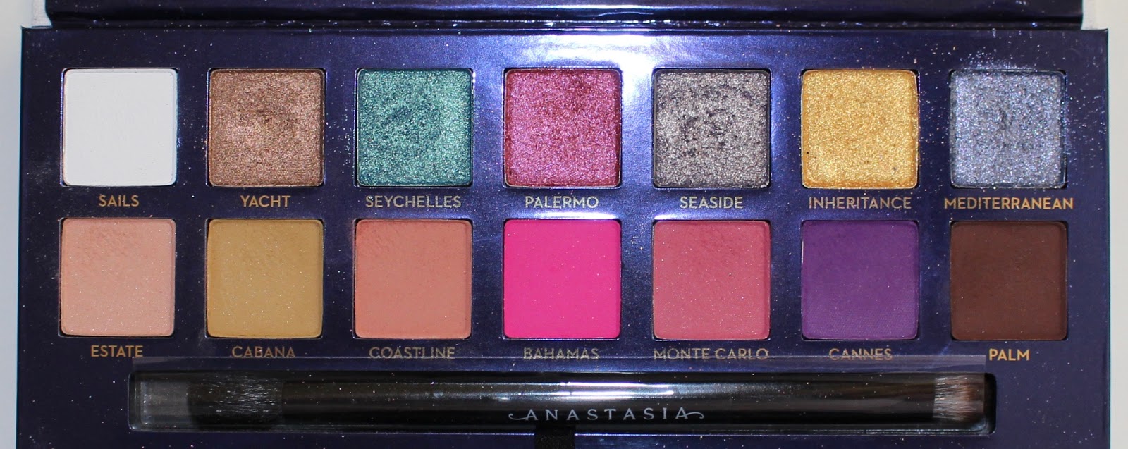
Review: Anastasia Beverly Hills Riviera Palette
If you're a longtime reader of my blog, you'll know that I don't post many reviews. And there's a few reasons for that. The first is that my blog isn't really about reviewing new makeup — it's about encouraging smart consumerism and breaking down marketing tactics. Another is that I don't buy a lot of new releases and therefore don't have a lot of content for "new product" reviews. And, finally, I don't want to be yet another person who might convince you to buy something you know you don't need.
With that said, I still think the occasional review can be helpful, and today I'm talking about the newest Anastasia Beverly Hills palette — Riviera.
When it comes to ABH, I have to say that I have a pretty unpopular opinion. I hated the Modern Renaissance palette and returned it because the shadows muddied on my eyes and I thought the shimmer color scheme was lacking. After receiving Subculture as a gift, I found that I actually really liked it and didn't think it was as hard to work with as Modern Renaissance — but most people really hated it. Lastly, I thought Prism, Norvina, Soft Glam, and Sultry were all incredibly boring and full of a TON of repeat shades.
When Riviera was released, I wavered on if I wanted to purchase it or not. I didn't have most of the shades in my collection, but I had shades that seemed close. And I wasn't totally sure how cohesive the color scheme would be for me.
But, I kept being drawn to it. There was something about the shimmers, specifically, that excited me. So, I decided to purchase my first ABH palette since Modern Renaissance.
And here are seven looks that I have done with Riviera.
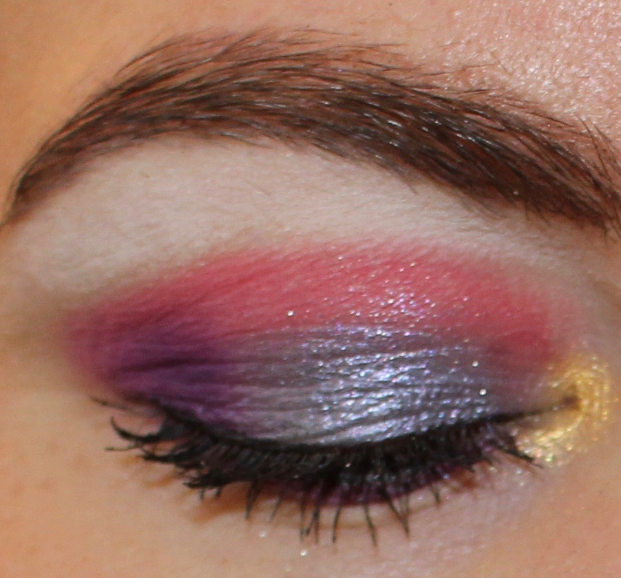
Look 1:
Lid: Mediterranean
Crease: Monte Carlo
Outer corner: Cannes
Inner corner: Inheritance
Brow bone: Sails
Lower lash line: Cannes
Mediterranean was one of the shadows that really called to me, and I think it's one of the standouts in this palette. I don't have any other shade like this one, and I find it to be really versatile. It can be colorful or neutral, and I think it's gorgeous. On the whole, I really liked this entire look. I was thrilled with how Monte Carlo and Cannes applied, and I loved how vibrant the gold looked on the inner corner. Sails is a very stark white, which made it a bit difficult to blend out on my skin tone, but I think it's a shadow that a lot of people would like.
Look 2:
Lid: Seychelles
Transition: Estate
Crease: Cabana
Inner corner: Yacht
Brow bone: Sails
Lower lash line: Palm
I hated this look. In stark comparison to look one, there was little I liked about this one. And that's really disappointing because I was so looking forward to this color combination, and it was a big miss for me. Estate looked like essentially nothing on my skin, and Cabana was quite dull and required several layers to look opaque. Cabana was an especially disappointing shade because, if you've been a reader for a while, you'll know that I love a good mustard. The mustard shade in Subculture (Edge) is my all-time favorite, and I was hoping (expecting) Cabana to be a good alternative. But, nope. Seychelles also required quite a bit of building up, which I didn't like.
Due to my disappointment in Estate, Cabana, and Seychelles, I considered returning Riviera after doing this look. But, I decided to try the rest of the shades first.
Look 3:
Inner lid: Inheritance
Outer lid: Palermo
Transition: Coastline
Crease: Monte Carlo
Brow bone: Salis
Lower lash line: Cannes
I liked this look. I loved working with the mattes, but I was a little disappointed in the shimmers. The gold, which applied gorgeously to my inner corners on my first look, didn't apply on the lid with the same intensity. It really had to be built up. Palermo was slightly easier to work with, but it also required some building.
At this point in the week, I was feeling quite a bit of buyer's remorse.
Look 4:
Lid: Seaside
Transition: Monte Carlo
Crease: Cannes
Outer corner: Cannes
Inner corner: Yacht
Brow bone: Sails
Lower lash line: Mediterranean
I started liking the palette again with this look, but I also realized how difficult Cannes is to blend. It looks worse in photos (with the flash) than it did in real life, but I would have preferred a seamless blend instead of what looks like a stripe. With that said, I love the color scheme of this look, and I especially love the shade Seaside. Like Mediterranean, it was one of the shades that really drew me to the palette, and it did not disappoint. The inner corner shade, Yacht, also really surprised me. I thought it was going to be a classic bronze, but it is like a bronze/rose gold. Yacht made me want to do another look with it as the focus.
Look 5:
Lid: Yacht
Transition: Coastline
Crease: Cannes
Inner corner: Seaside
Brow bone: Sails
Lower lash line: Cannes
I loved this look. Yacht was the wildcard shadow in this palette for me. I thought nothing of it at first, didn't really even notice it, and now it is my favorite shadow in the palette. Cannes was still difficult to blend, but I love the color and truly have nothing like it in my collection. At this point, I no longer wanted to return this palette.
Look 6:
Inner and outer lid: Palm
Center of lid: Yacht
Transition: Estate
Crease: Sydney Grace Cool Brown
Inner corner: Seaside
Brow bone: Sails
Lower lash line: Palm
For this look, I decided to go pretty neutral. I did this for two reasons. One was to use Palm, and the other was to show that even in this "colorful palette," it's possible to get a very neutral look. I liked this look and thought it was dramatic and pretty. It was the only look that required me to bring in another shadow, which was a cool matte brown from Sydney Grace. I could have used Palm in the crease, but I didn't want to go that dark.
Look 7:
Lid: Palermo
Transition: Monte Carlo
Crease: Bahamas
Outer corner: Bahamas and Cannes
Inner corner: Inheritance
Brow bone: Sails
Lower lash line: Monte Carlo and Cannes
For the final look, I wanted to use Bahamas — the hot pink. In most of the reviews I had seen of this palette, people heavily featured this shade. I would guess that's because Bahamas is the brightest shade in the palette, and when you're looking at Riviera as a "bright" or "colorful" palette, this will be the shade you use to showcase that. I have a few colorful palettes and several hot pink shades, so I wasn't in a rush to use Bahamas. But, this ended up being one of my favorite looks I did with the palette, and I received a ton of compliments on it. By this point in the week, I was very happy with my purchase.
Final Thoughts
If you've read through this entire post, you'll see that I really felt conflicted with this palette. Some days I hated it and really regretted my purchase. On others, I was incredibly happy with it. This is generally why I personally don't like "first impressions" review content, because opinions can drastically change the more you use a product.
There are two shades in the palette that disappointed me — Estate and Cabana — which are the peach and mustard shades. Something that I find in a lot of ABH palettes is that the lighter mattes can be a bit chalky and won't work for skin tones deeper than very light. I have a light to medium skin tone, but because I have a warm olive undertone, a number of shades that are traditionally made for "white skin" don't show up on me. And if these shades are lacking on my skin tone, I imagine that they would be lacking on deeper skin tones as well. This is certainly a palette that is more friendly toward deeper skin tones than most releases from ABH, so I was disappointed in these two shades.
Additionally, I don't think this palette needed light shades at all. I think it's disappointing how many brands include these "staple" shades for light skin, and it's also disappointing how many reviewers complain when a palette lacks these shades. There are not equivalent shades for deeper skin tones, and I think it's wrong to include "staple" shades for light skin only.
However, the majority of shades in Riviera can work on a wide spectrum of skin tones, and that is something I appreciate.
Yacht is the standout for me, and Mediterranean, Seaside, Cannes, and Monte Carlo were my other top shades. Seychelles, Palermo, and Inheritance are all decent shimmers, but they didn't stand out too much among other similar shades in my collection. Bahamas and Palm are solid mattes that work well in the palette, but, again, I have other matte hot pinks and matte browns in my collection. I liked Coastline quite a bit, but I don't know how well that shade would show up on diverse skin tones, so I'm hesitant to praise it. Sails is a very stark white, which isn't something that I personally love, but it's a good shade for what it is, and I used it every day.
To me, Riviera is not a "colorful" or "bright" palette. I think this is a different take on what is typically considered neutral. Or, it's a "beginner colorful palette" for someone who is curious to try more color, but doesn't want an entire neon rainbow look. Therefore, while Riviera certainly has less brows than most ABH palettes, if you're looking for a really vibrant and colorful palette, this is not the one I would recommend.
With that said, I personally enjoy the color scheme and find it quite inspiring, and I am ultimately happy with my purchase. I have a sizable eyeshadow collection that I routinely declutter and curate, and there are several shades in this palette that I have never seen before, let alone owned.
This is a palette that I know I will use and enjoy for a long time. But, I don't think Riviera is for everyone, and I don't think it's so special that anyone who doesn't have it is missing out.
Radiant Lift is Max Factor's latest foundation that promises a radiant finish and all day hydration. I was sent two of the darkest shade...
Max Factor Radiant Lift Foundation
Radiant Lift is Max Factor's latest foundation that promises a radiant finish and all day hydration. I was sent two of the darkest shades we have in our drugstores, which I couldn't test, but since there was some interest expressed on my Instagram about how I like this formula, I went to the drugstore and got myself a sample of shade 45, the lightest available here. The latter is again much too dark for me, but I can at least lighten it with The Body Shop Drops - something I couldn't do with the other two shades. It's worth mentioning that this exists in 18 shades, but I guess our market (and surprisingly German too I hear) isn't worthy of the lightest shades. Rant aside I like this formula and if a pale enough shade exists and it didn't break me out, I'd definitely be adding this to my collection.
Texture: Formula is creamy and not very liquid, but I had no issues blending this and it works with all methods. It’s one of the nicest foundations on the skin I’ve tried so far, it reminds me of Milani’s Conceal + Perfect in how well it looks and wears. It doesn’t slip into lines or pores and doesn’t go cakey. Unfortunately it appears this formula breaks me out, which is a shame, but obviously, this a problem specific to my skin and don't think the same will happen to most of you.
Coverage and finish: Coverage is a good medium. It covers enough for me, but some extra concealer is needed on dark circles and spots as is usual for most such foundations. Finish is somewhat satin, but it does have this non-dewy/wet glow that isn’t sparkly or super strong despite the gold shimmer in the formula.
Shade: I have three shades to compare, on the pictures I'm wearing 45 Warm Almond mixed with TBS Adjusting Drops. 45 is a light-medium shade with quite an orange tone to it, which is especially apparent when you compare it to Catrice's HD Liquid Foundation 010. 75 Golden Honey is quite a deep medium shade with a strong yellow tone and 79 Honey Beige is even darker with a much more neutral undertone. Shade selection in Slovenia is absolutely terrible with only 5 medium toned colours and as I said 18 in total exist shades. Why they didn't include something lighter, I don't know and don’t really care, as by now there’s enough good competition that I can simply buy a foundation from another brand (like Milani's Conceal + Perfect which is cheaper and comes in a perfect shade for me).
Staying Power: This is another one of those foundations that fades nicely on the skin. I haven't noticed any patchiness or dryness (my skin is normal-dry at the moment). The promise is for all day hydration which I think stands, since my skin didn't get drier with this, while in terms of how well it stays on the skin, on me it's quite good, at least 8h+.
Scent: This is one of the most fragranced foundations which can be a problem for some. It's got a strong orange medicine scent.
Packaging: I'm a fan of the packaging. It's a nice glass bottle with a pump which works as it should. Overall it's a pretty looking foundation.
Price and availability: These are available in most drugstores. The price in Slovenia is 15.39 € (Müller).
This is worth checking out if you're looking for a nice drugstore foundation, but be aware that the shade range is poor here. It's a good medium coverage foundation with a natural finish and a formula that's doesn't emphasise pores or lines. Such s shame it breaks me out and about the shade range.
Have a great day!
*PR product
Đăng ký:
Bài đăng (Atom)


Follow Us
Were this world an endless plain, and by sailing eastward we could for ever reach new distances